
What’s the optimal amount of debt in a buyout? Ask ten investors, get ten answers. We at Coller analysed 1,789 PE exits to find out. Our analysis reveals a clear ‘Goldilocks‘ leverage band where outcomes are strongest. These findings inform how our AI models underwrite private companies in secondary transactions.
The balancing act
Debt amplifies equity returns when things go well, but it can destroy value when things don’t. Too little leverage, and you leave returns on the table. Too much, and you risk value destruction and extended hold periods. Somewhere in between lies the Goldilocks Zone, and the data make that non-linear trade-off visible.
What our analysis shows
We analysed 1,789 realised PE-backed exits using average Net Debt/EBITDA over each hold period. When assessing across three different waypoints, the pattern is striking.
The first waypoint compared median total value by paid in capital (TVPI) by leverage band and found the sweet spot was 2-6x leverage. TVPI peaks around 2.2–2.3x with materially lower loss rates. This is the Goldilocks zone for risk-adjusted returns.
The second waypoint reveals that outcomes deteriorate and loss rates rise to more than 30% when the leverage band increases to 6-7 x. These investments require deeper scrutiny.
The third waypoint suggests that the high risk zone is leverage of 8x or above. Perhaps unsurprisingly, these investments have a consistently heavy downside-with median TVPI below 1.0x and loss rates exceeding 50%.
| ND/EBITDA | N | Loss rate | Median TVPI | Median Hold (years) |
| 0-1x | 185 | 41.1% | 1.19x | 5.63 |
| 2-3x | 225 | 19.6% | 2.19x | 5.21 |
| 3-4x | 252 | 21.4% | 2.30x | 5.33 |
| 4-5x | 310 | 24.8% | 2.24x | 5.43 |
| 5-6x | 231 | 18.6% | 2.30x | 4.96 |
| 7-8x | 125 | 51.2% | 0.99x | 6.66 |
| 8-9x | 64 | 67.2% | 0.30x | 6.04 |
Three leverage waypoints
Two insights that matter – high leverage often means worse outcomes AND longer holds.
Highly levered situations (7x+) are associated with longer hold periods on average, consistent with extended workout dynamics, i.e. constrained cash flow, narrower exit paths, and time required to deliver before a sale becomes feasible.
The 5–6x band stands out with top-tier TVPI (2.30x), lowest loss rate (18.6%), and shortest median hold (4.96 years).
Low leverage is not automatically ‘safe‘. The 0–1x band has a 41.1% loss rate and only 1.19x median TVPI. This bucket likely includes distressed situations alongside cash-rich businesses. Low leverage requires context; it’s not a free pass on risk.
How this informs our AI underwriting
Findings like these don’t sit in a research silo—they feed directly into how we underwrite. Our AI models use leverage as one of many signals to underwrite private companies, combining it with revenue, margins, sector dynamics, valuations, and macro indicators to build a complete picture.
A company with leverage at 6.5x but with strong coverage, improving margins, and a credible deleveraging plan looks very different from one with deteriorating fundamentals at the same leverage level. Our models help us make that distinction at scale.
What this means for secondary buyers
Secondary investors buy mid-hold so the key question is that given leverage today, what do outcomes and time to liquidity look like? As we underwrite, we perform more in-depth analysis to ensure our models rely only on information and signals only available at the time of underwriting.
However, a practical screening framework:
- 2–6x: Historically strongest outcomes on average
- 6–7x: Increased scrutiny required
- 8x+: High-risk tail; require meaningful compensation and a clear deleveraging path
Stress-tested under recent conditions
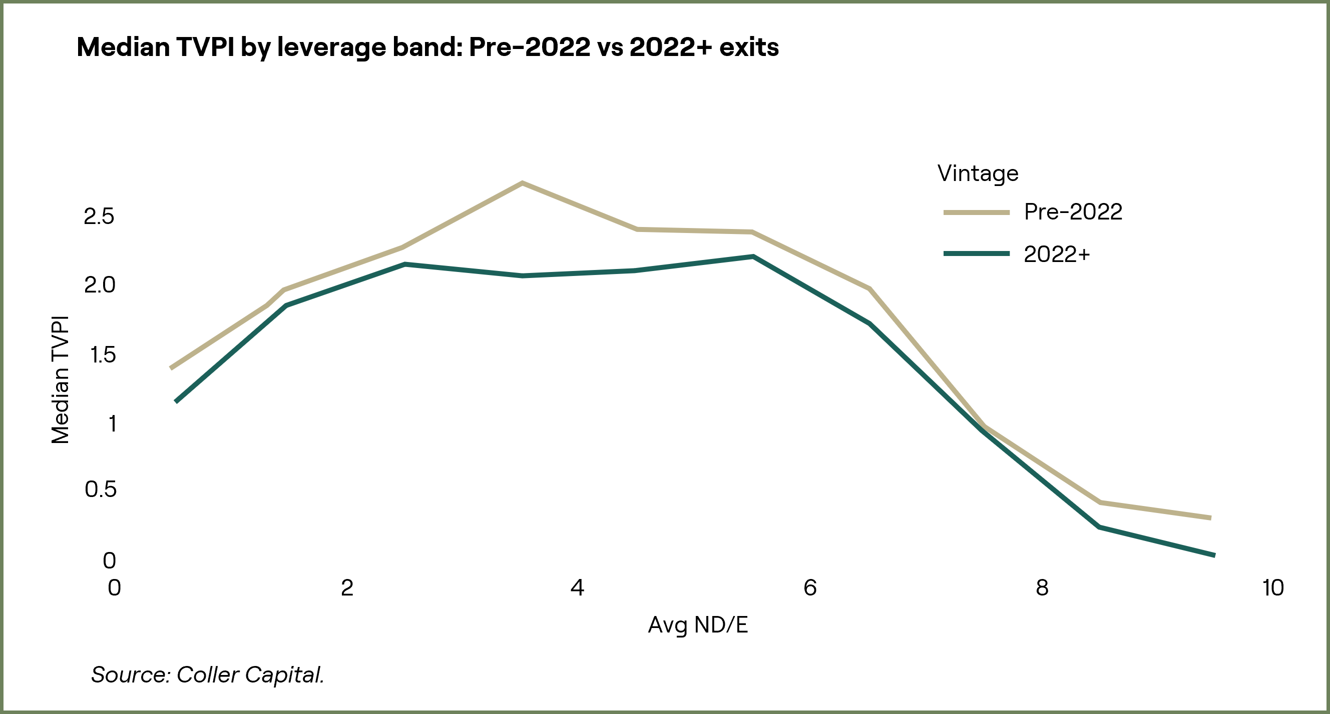
Returns compressed across all bands in exits post 2022, with higher leverage bands (4–6x) showing directionally more fragility. This suggests the Goldilocks zone may narrow under stress, reinforcing why dynamic monitoring matters more than static rules.
Key caveats
Survivorship bias: We only observe exited companies. Non-exited high-leverage situations could make the downside picture worse.
Correlation, not causation: Leverage may proxy for business quality, sector mix, and vintage—not just capital structure.
The bottom line
Across 1,789 realised exits, the pattern is consistent: 2–6x ND/EBITDA represents the Goldilocks zone for leverage. But leverage is one input, not the answer. By feeding insights like these into our AI underwriting models—alongside human judgement—we transform a simple screening metric into a robust framework for better risk-adjusted decisions through cycles.
Leverage measured as average Net Debt/EBITDA over the observed hold period, with outliers excluded (0–10x range). TVPI represents total value to paid-in capital at exit. Loss rate defined as percentage of companies with TVPI < 1.0x.
BD/EBITDA: Net Debt divided by Earnings Before Interest, Taxes, Depreciation, and Amortisation—a common measure of leverage.
TVPI: Total Value to Paid-In capital—measures total return relative to invested capital.
Loss Rate: Percentage of investments returning less than 1.0x invested capital.
Goldilocks Zone: The leverage range where outcomes historically optimise between risk and return.